
G-G Diagram
I've seen the whole Throw back Thursday thing, so here is an article from the old blog going back 10 years!
G-G Diagram / aka The Friction CircleIf you've made it to this blog, you're probably familiar with the friction circle. As a quick review, it’s the theoretical circle of forces that a tire can develop – 100% accelerating, 100% braking, or 100% cornering in either direction. The exciting part is as soon as you start using less than 100% of one direction, you can start using some of another direction. This idea is what gives us the friction circle. The actual friction circle that the car can achieve is shaped sort of like a heart without the divot in the top. Some Googling says the shape is real name for the shape is a curvilinear triangle. Who knew?
But, we’re getting ahead of ourselves a little bit. Every data analysis program will make us a scatter plot of our long. and lat. G forces. Some programs, like Traqview do it automatically. In others you have to do an X-Y Plot of the long. and lat. G force. Once we do this, a common name for the graph is a G-G Diagram. This diagram can tell us a lot about our driving and the car in transitional areas. We can learn much more than the often hear “Look, I corned at 1.5 Gs!”
As a driver, it’s easy to develop all of the cars G Force when just turning, braking, or accelerating. When we start to combine the corning with acceleration when exiting a corner, it’s harder but most of us are pretty good at it. The hard combination is braking and cornering – what we all think of trail braking. Most of us can do it but not anywhere near the limits of the tires (or car). The G-G diagram is what helps us to see how well we are actually trail braking and using all of the traction that is available to us.
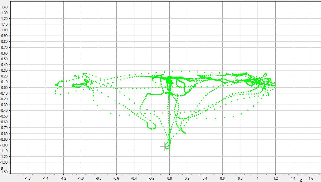
The diagram gives us a quick visual method to check the shape of the points to see how we are doing using all of the cars traction. In the green diagram, you can see that the lower sides are almost inverted. There is good braking G force, but as soon as any lateral loads are introduced, the braking force decreases (less G force) very quick. This means the driver was not making full use of the tires traction abilities. The tires still had enough traction left to continue braking at a higher level while doing the same amount of cornering.


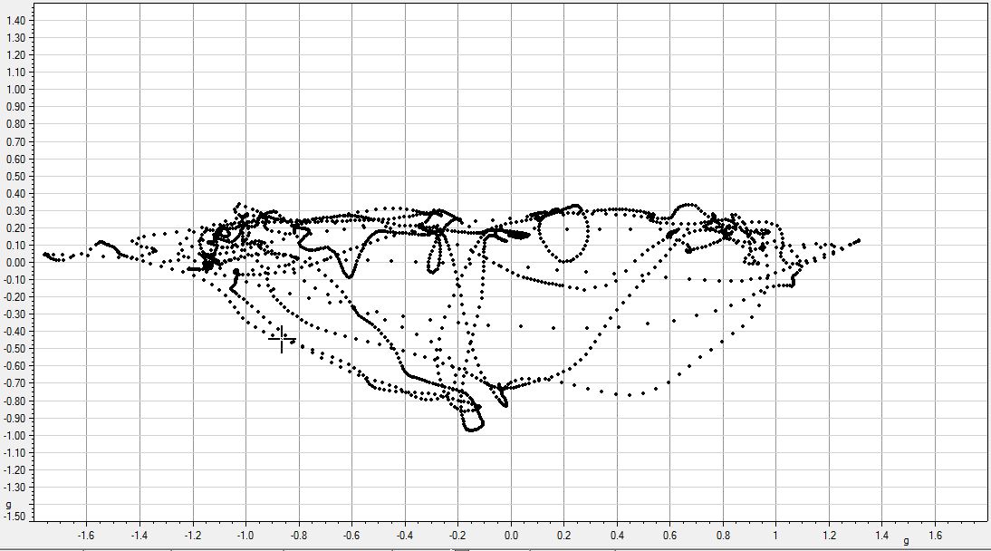
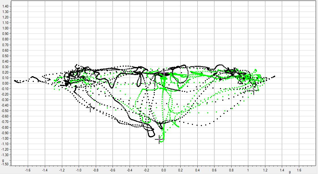
In the black diagram, you can see the bottom edges are much more rounded and create more of a circle. It shows that there was a better transfer from straight line braking to corner and more trail braking. While not perfect, it’s much closer to a full circle. When you compare the black to green trace, you can really see the difference in how much trail braking was done and how well the driver transitioned from braking to cornering.
The same ideas are valid for throttle and cornering, but it’s not nearly as often that people have trouble with that area. You will almost always see a good round top to the graph – it’s not nearly as hard to accelerate out of the corners as it is to trail brake in!
That’s not all we can get from this graph, but it’s a good start. It’s a far way from just seeing how hard we are braking or cornering. Now you can evaluate your transitions from braking to cornering. And since this graph is a good approximation for your cars traction circle, you can see just how much of the available traction you are using.
Recent Posts
-
Position Sensors
So you want to know where something is? There are a lot of options! In motorsports we measure the po …Feb 2nd 2025 -
Pressure Sensor Info
So you want to measure a pressure? Gauge or absolute? Air or liquid? If air, gauge, absolute, or dif …Jan 22nd 2025 -

Driver health, monitoring, and performance
I was surfing Instagram and saw Dr. David Ferguson, of the Spartan Motorsports Performance Lab, post …Mar 22nd 2022